EffinFunny Productions ran a Kickstarter campaign for their all Desi cast “actual play” D&D show. The idea was to produce a show in the vein of Dimension 20, and Critical Role, where the actors sit around the table and play the game, getting into character and—depending on funding—using sets on the table and minis to represent the action of the game. The campaign was fully funded in under SIX hours and ended up reaching just over $150K (THREE times their funding goal).
In addition to creating the graphics used in the Kickstarter campaign, once the show was funded, I worked with the team at EffinFunny to create graphics for the marketing surrounding the show, including the show’s key art.
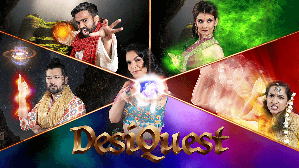
DesiQuest Show
Key Art
I really enjoyed working on this project as it allowed me to create some pretty rad visual effects using the Boris FX Optics plugin for Photoshop. The idea was to create an image that showcased the actors dressed as their characters performing magic that related to the class that each of them play in the campaign.
Digital Graphics
For many of these graphics, I combined elements from past designs I created for marketing of the show as well as graphics created by another designer that were used in the show itself.
Thumbnails
—I created various thumbnails for: show episodes, podcast versions of the episodes, cast Q&As, and the after show podcast.
Online Store Graphics
—I created these graphics for use in the DesiQuest online store. These were all items with no physical component so we couldn’t just take a photo of the items and upload them to the site. So, I created graphics that would be good representations of the content/guides as well as seats at D&D games involving one or more cast members.
Overlays
—As one of the rewards for Patreon subscribers and Kickstarter contributors, the cast streamed a Q&A session after the world premiere. They streamed live on YouTube and I created these overlays for them to use for that livestream and any future Q&A livestreams.
Social Media Graphics
—I created these social media graphics for various announcements including a sponsorship by Candela Obscura, schedule for episode drops, and the cast going to PAX Unplugged.
Kickstarter Campaign Graphics
I initially created the key art “Hero” image for the show and from there, created various graphics to be used on the Kickstarter page, images to post on Instagram to announce the campaign, and a pitch deck to assist in obtaining additional funding.
Kickstarter Campaign Hero Image (Key Art)
The idea the client had for the initial concept, was an Indian woman with a D20 as her 3rd eye. After I created that concept (using images I sourced through a free-for-commercial-use stock image site), they decided they wanted to see another option. They sent me a stock photo of a woman’s hand with Henna designs on it and I created the rest using some of the imagery from the first concept as well as some new imagery I created in Photoshop with additional stock imagery I sourced. When selecting the font for the key art, I submitted the final design with 8 font variations. They ended up sharing them all on their Twitch channel to see what their fans liked best and that is what we went with for the final piece.
Stretch Goals & Progress Bars
I used the same concept for the Stretch Goals and Progress Bar images. I created these in Photoshop, utilizing the Boris FX Optics 2022 plugin to create the lightning effect on the fully completed bar/stretch goal images. I illustrated the leather wraps, staff, and gem holder and used a stock image for the gem and the overlay on the staff. I created these so the client could swap out to the appropriate image as they made further progress during the campaign and unlocked additional goals.
As the campaign approached the end, the client wanted me to adjust the end goal on the progress bars to be $200,001 and to make additional images for smaller increments to help encourage contributions. They wanted the progress bar to better reflect the actual funding progress, rather than having to wait until we received an additional $25K in contributions to update the graphic. We didn’t make any changes to the Stretch Goal graphics during the campaign.
Reward Tiers
When I designed the initial concept for the reward tiers, we didn’t know how many tiers there would be. Once they sent me the information for the tiers, I realized my initial design wouldn’t work. I kept the same idea and created an additional concept and from there, it was really about adjusting the sizing of each tier “piece” and changing colors. Once we were nearing the finish line, I decided to change the background image. Though the varying colored backgrounds tied into the Hero image, I felt they made the design too busy and distracted from the text on each piece. Since the text is the most important part of these pieces, I went with a much less distracting background that tied into the feel of the campaign and used other elements within the design to tie into other campaign imagery.
The Creators Images
As I do with many of my projects, I included multiple versions of the design with slight changes— different fonts, text alignment, colors, and swapping out the D20 graphic between a flat version and a 3D version—with each of my client’s included drafts for the project. As you can see from the drafts and final versions below, the final design didn’t veer too far from the initial concept.