Below you can see a few examples of various printed media I have created for past clients. This page doesn’t include any posters or key art, as I have another page dedicated to those projects. If you’d like to take a look at those images, click this link: Posters / Key Art.
Programs and Guidebooks
Hollywood Fringe Festival Guidebook, 2025
In 2022, I was contracted by The Hollywood Fringe Festival to completely redesign their festival guidebook that they had used since its inception in 2010. I worked with the Fringe team to improve the guidebook by: making them physically larger; printing in full color; adding easier-to-locate section headers; encouraging participants to include bleed in their ads thereby increasing the ad imprint, visibility, and perceived value (while also making ad pages look cleaner); and overall improving the layout and font sizing to make content much easier to locate and read.
Since 2022, I have designed each year’s guidebook and am responsible for the layout, design (excluding the guidebook cover and ad artwork), formatting, and some ad copywriting you see throughout the guidebook. In addition, I work directly with the print team from delivery of the print-ready files, through the proofing process, through printing and delivery of the finished guidebooks.
*The first spread is the outer cover. The rest of the guidebook is displayed in spreads as they would appear if you were flipping through the physical guidebook. The final spread is a map that we printed across the final page of the guidebook and the inside back cover.*
Boston Court Winter Program, 2018
Prior to the Fall 2017 season, Boston Court Performing Arts Center would create one professionally-printed program for that season’s theatre performance and each weekend, we would create and print (in-house) a program for that weekend’s concert(s). Beginning with the Fall 2017 season, they decided to professionally print one program for everything. This was quite the undertaking as it required the musical guests to nail down their programs sometimes months in advance of their performances. For both the Fall of 2017 and Winter of 2018, I worked directly with the talent as well as the Artistic Director of Music to get that information in time. In addition, I reached out to other talent/crew and staff for bios and other program information.
The design you see here is my complete redesign of the look, feel, and layout of their program. I created all of the graphical elements including Boston Court ads you see in the program excluding the artwork for Her Portmanteau, A Streetcar Named Desire, and the advertisements for the hotel constance and performing arts LIVE. The photos are mostly those provided by the artists with a couple selected by me from previous performances/events. I worked in InDesign to for layout and design and created images in Photoshop and Illustrator.
Brochures
Boston Court Season Brochure, 2018
Each year, Boston Court Performing Arts Center mails out a brochure for their upcoming season. In previous years, the brochure was twice the length and they wanted to cut down the number of pages but still have the content be easy to read and easily digestible. I was provided professionally shot photos of the location and events and selected the ones to use in the brochure. I designed the layout for this brochure mailer in InDesign and created the background textured images in Photoshop.
JAG Gym Summer Games Camp Brochure
Every year, JAG Gym has a gymnastics summer camp and during the 2016 Rio Olympic Games, they decided to celebrate the games by changing the name of the Camp to “Summer Games Camp.” I created a version of the JAG Gym logo inspired by the Olympic torch and that imagery was used on staff shirts as well as in this brochure. We would usually go with a standard one-fold mailer, but I wanted to try the four-fold design and we were really pleased with how it turned out. The first images are each panel in the order in which you would read them from opening to flipping over and reading the back. The last two images are the outside of the brochure and then the inside open and laid out flat. The majority of the photos you see in the brochure were taken by me.
Business English Elite Brochure
I designed this brochure for Business English Elite as well as the logo you see in the brochure. My client provided me with images to use and I selected which ones to use and where. The first page is the outside of the brochure and the second is the inside.
Large Format Signage
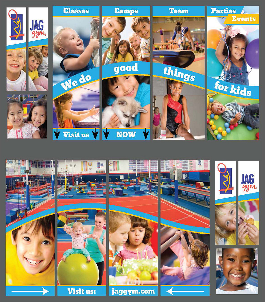
JAG Gym Vinyl Window Signage, 2015
While working at JAG Gym, I was tasked with designing window signage for the second floor outside-facing windows. This was something they hadn’t done before and required me to not only utilize photos I had taken myself but also source appropriate stock footage that would print well at such a large size. The final design had a combined footprint of 7’ x 29’. The final signage was installed in one line with the panels on the top being installed on the left above the main entrance doors and the bottom panels installed directly to the right of the other panels. There was a gap between the two panels where there were no windows. (gray background to show space between each window).